Venture Capital
Dashboard - Flow Inc
A new dashboard tailored to the needs of the company's
product offerings and their users needs.
Description
About the project
Overview
We observed that our users, both General Partners (GPs) and Limited Partners (LPs), of our B2B SaaS software for private market funds struggled to quickly find essential investment information. The customer success team reported frequent calls from users seeking help locating basic information. During our monthly sync on user feedback, we discussed how to address these issues and identified several significant problems with the existing dashboard. It lacked glanceability, making it difficult for users to get a clear overview of their investments. Users couldn't quickly identify which tasks required their attention or locate critical due diligence documents.
Previous teams had created the dashboard years prior with little research or input from a product team. They designed it to check a box rather than meet user needs, and it focused on an outdated data set from when the company offered a few services to a much smaller user base. As a result, the dashboard failed to address any of the requirements of current users, quickly being able to find tasks that needed attention, glanceability of current money owed or any overview of multiple investments, so they largely ignored it.
Instead of attempting to rework the broken system, I proposed starting from scratch. After presenting evidence from external user research, stakeholder workshops, and internal feedback from the customer support team, the founding CEO trusted my recommendation and gave us the green light to build a new dashboard tailored to the needs of today's users.
The Team & My Role
- The Lead Product Manager, Lead Engineer, and I, the Senior Product Designer, worked directly with the company's founding CEO.
- I also worked with our Client Advisory Board, which included General and Limited Partners.
- All product and visual design to get the product ready for launch
Goals & KPIs
- Decrease user questions to support by 20%
- Decrease messages to GP from LPs by 25%
- Keep a greater than 75 NPS score
Where We Started
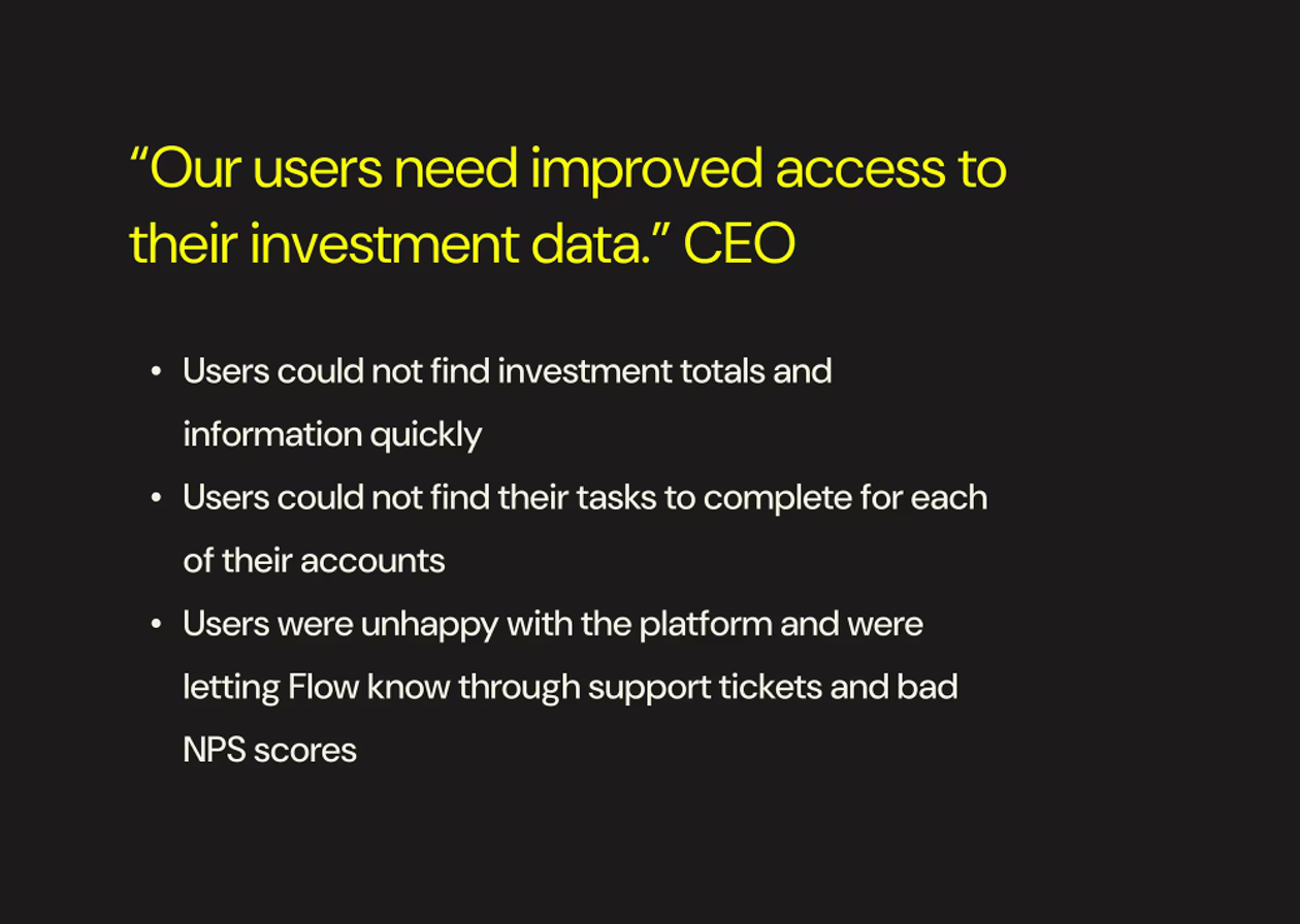
Users could not find the information they wanted, affecting their happiness with the platform.
Research
To inform our approach, we conducted a comprehensive deep dive into our internal data, customer feedback from emails and user research, insights from our customer success agents, and other internal metrics. Working closely with the PM, we identified initial ideas for what the dashboard needed to display based on user needs and pain points.
Users consistently expressed the need to:
- View totals for amounts owed or already paid.
- Access outstanding contracts, agreements, and other paperwork requiring signatures.
- Break down their investments by individual or group.
- Easily track tasks tied to specific investment accounts, especially since many users managed multiple roles—for example, acting as a GP for one fund while being an LP across several others.
Our competitor research further clarified the opportunity. Most competing dashboards displayed everything all at once, resulting in cluttered, spreadsheet-like designs that were difficult to read at a glance. Information was often crammed together, with poor hierarchy and no apparent system for managing users with multiple accounts or personas.
Despite these shortcomings, competitors consistently highlighted key investment metrics, such as committed, contributed, and unfunded amounts. These metrics aligned with the feedback we heard during client workshops, affirming their importance in our design. This blend of user insights and competitor analysis laid the foundation for a dashboard prioritizing clarity, glanceability, and usability.
Personas & What To Design
When I joined the team, it quickly became apparent that our understanding of our customers was based more on anecdotal assumptions than actual data. When I asked about our users, the answers were inconsistent and lacked evidence. During client research, I noticed an apparent disconnect: the customers I interacted with were significantly younger than the internal narratives suggested. It became evident that we didn't truly know our users and this lack of clarity hindered our ability to design effectively.
To address this, I partnered with our lead data scientist to analyze all available user data and search for patterns that could provide a clear picture of our audience. Given the sensitive financial data, we had to use diffrent pieces of client information to corelate who our users were based on the information available to us. The findings were helpful: our customer base was almost the opposite of the team's belief, our users were younger, more techy savy, and often away from their desk more then anyone believed. This allowed us to change long-held assumptions. This realignment allowed us to create designs and strategies that met the visual and on the go nature of our users. The trust leadership placed in me throughout this process underscored the importance of questioning assumptions to deliver impactful, user-centered solutions.
Approach, mockups, interaction, and the user experience
From the start of the research phase, I quickly moved into wireframing to develop initial ideas and visually align the team. As research insights emerged, I rapidly iterated on designs to ensure they reflected our evolving understanding. To support this agility, I leveraged a newly redesigned design system that I had recently spearheaded, focusing on simplification and transitioning it into Figma. By highly componentizing elements like navigation, footers, headers, and cards, I was able to quickly translate research findings into structured layouts. This streamlined approach accelerated wireframing, ensured consistency, and allowed us to stay focused on crafting a dashboard that truly met our users’ needs.
As the designs became more refined, I continued engaging directly with clients through calls. These conversations were crucial to validating our work and demonstrating that we actively listened and incorporated their feedback into the product. This approach helped build trust, foster stronger client relationships, and encourage honest, constructive feedback. During this stage, we began solidifying decisions around what information the dashboard would display and how to present it best to meet user needs.
We would often discuss initial ideas with our CAB and decide what was most important to them. Then using their feedback and analytics we could try to verify via data what they were saying.
Collaboration with engineering had also kicked into high gear. While I like to involve engineering early and often, this phase requires deeper engagement to explain the rationale behind design decisions and align with the technical feasibility. It was vital to map out any backend work needed for new calculations, data storage, and retrieval, ensuring the designs were functional and implementable.
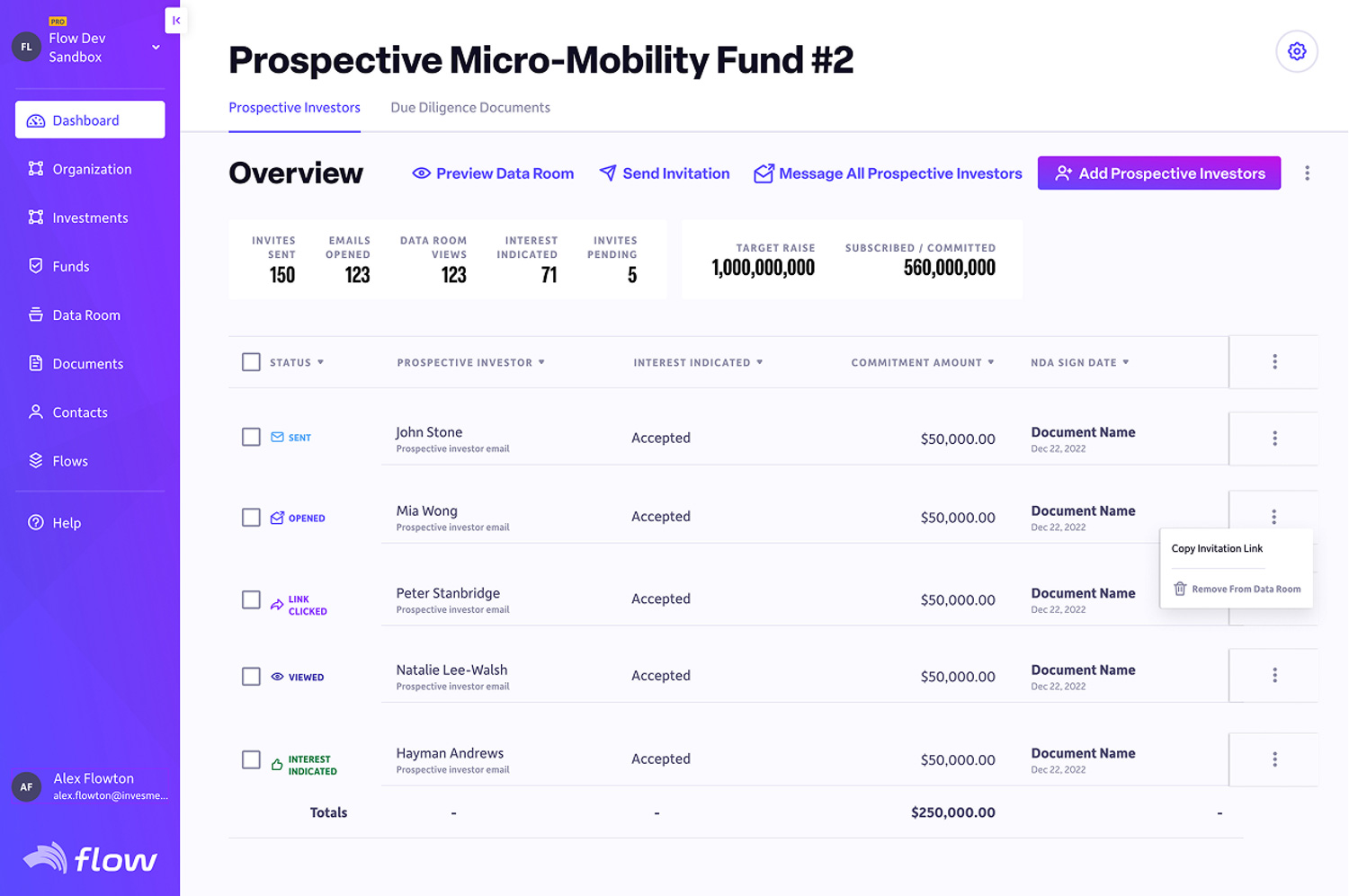
As the project progressed, I made the critical decision to separate the dashboards for GPs and LPs. This decision came from a clear understanding of user personas: LPs typically had one or two investments, whereas GPs managed eight to ten funds with hundreds or thousands of investors in each. Their needs were fundamentally different, and trying to address both in a single dashboard would have compromised the experience for both groups. Additionally, LPs represented most of our users, so delaying their dashboard to accommodate GPs would have been a missed opportunity.
Earning and Using Trust
Leadership’s trust wasn’t just given, it was earned by demonstrating a deep understanding of the business and our customers. The decision to split the dashboards into two treatments wasn’t arbitrary; it was the result of immersing myself in the company’s goals, user needs, and market dynamics. By showing that I “got” the business - anticipating challenges, aligning design with strategy, and making decisions that balanced user experience with business outcomes - I established credibility as both a designer and a strategic thinker. This trust gave me the autonomy to move forward confidently, ensuring we could focus on delivering the best possible outcomes without unnecessary roadblocks.
By prioritizing the LP dashboard, we could launch sooner, collect valuable real-world data, and gain insights to inform future iterations. Meanwhile, separating the GP dashboard allowed us to give it the proper scope and attention required, ensuring it would meet the unique needs of that persona. This strategic decision balanced efficiency with quality, enabling us to deliver meaningful results for all users without sacrificing the integrity of the designs.
The Results
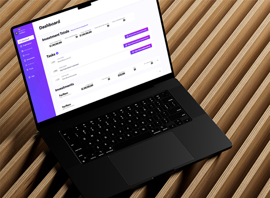
On the Flow app, users experience periods of intense activity followed by prolonged inactivity between logins. Having their investment totals at the top of the dashboard was vitally important. Tasks were second in importance; during deal opening and closing, there were a metric ton of documents to read and sign. Users needed all of those consolidated in one place. Finally, showing users their separate accounts helps them understand where they have invested and with whom.
- Create quickly glanceable investment totals.
- Place calls to action front and center, clearly indicating tasks to complete and the relevant funds.
- Allow easy access to all investment accounts.
Achieved Goals & KPIs
- We decreased user questions to support by 30%.
- We decreased messages to General Partners from Limited Partners by 40%.
- We increased our NPS score up to the low 80s.
Final Designs
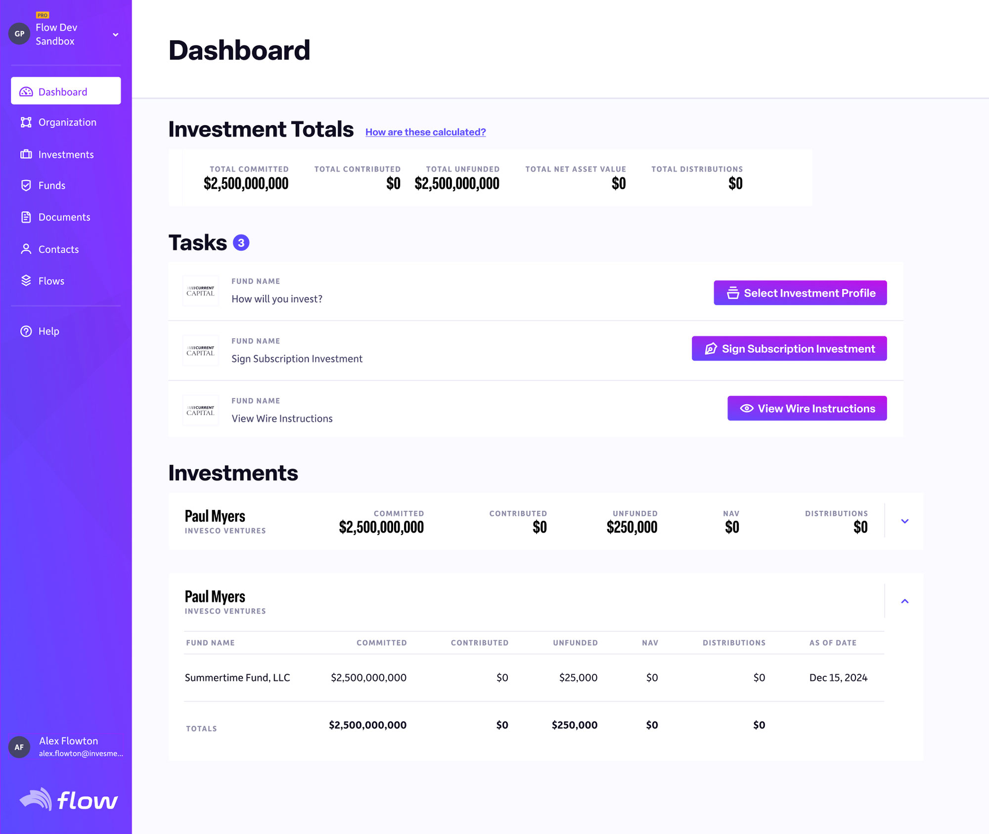
A finished dashboard with quick glanceable investment totals, calls to action front and center, and ease of access to all the different investment accounts.