ThreadWell Digital
Intake - TailorCare
A fast, secure, and user friendly patient facing digital intake.
Description
About the project
Overview
Patients need access to TailorCare's services, including our recommended care pathways, to help them achieve better health. Clinical Navigators currently complete patient intakes via phone.
Our Navigators are licensed Physical Therapists. Their time is valuable but not scalable, so how do we allow them to focus on eligible and high-value patients while still getting ineligible patients an intake and a pathway to follow?
TailorCare staff needs help handling increased patient volumes, particularly those referred to us but ineligible for our services. We want to provide value to these patients while focusing on high-value and eligible populations. Being eligible allows us to perform revenue-generating activities with this patient.
The Team & My Role
- The SVP of Product, Director of Product Management, Lead Architect, and I collaborated to validate our ideas and draft a comprehensive one-pager.
- I also worked with our Clinical Operations Manager on all patient-facing questions and changes.
- I designed the entire UI/UX and visual design to prepare the product for launch.
Goals & KPIs
- Decrease Navigator time spent with ineligible patients by 75%
- Increase Navigator time spent with high-value patients by 50%
- Maintain an NPS score above 85
Where We Started
We started this entirely from scratch; it is a new product line. We used this opportunity to expand beyond the homegrown, internal use product we had previously built and release it to be a more responsive web-based product we could share with external parties.
As an experienced product designer, the SVP trusted that my research and general insight into the user experience internally and externally would allow us to move quickly on this project. During planning, I created flows and mockups to get Engineering up to speed and enable them to start sizing tickets they would have to make.
Strategy
To meet the company's goals of engaging patients likely to have surgery and helping those patients avoid unnecessary surgeries, we need to engage more patients overall. Patients not yet ready for surgery need an alternative solution that minimizes reliance on our high-cost navigators, while our digital world still provide patients with care and physician recommendations.
Through workshops, we learned from primary care providers that they prefer to refer their entire musculoskeletal panel without pre-screening for eligibility for TailorCare.
To scale our ability to handle more patient referrals, we need a no-navigator option for our care model, where interaction with expensive TailorCare Navigators is not required or minimal.
To achieve this, we set about creating a digital version of our intake that guides them in simple, everyday language, offers a personalized care plan, and even connects them with local providers and other perks that make their journey more comfortable and accessible.
During our validation phase, we focused on perfecting the patients' experience from when they first connected with TailorCare to when they received a recommendation and were ready for the next steps. This helps patients feel supported and empowered to make informed decisions about their care.
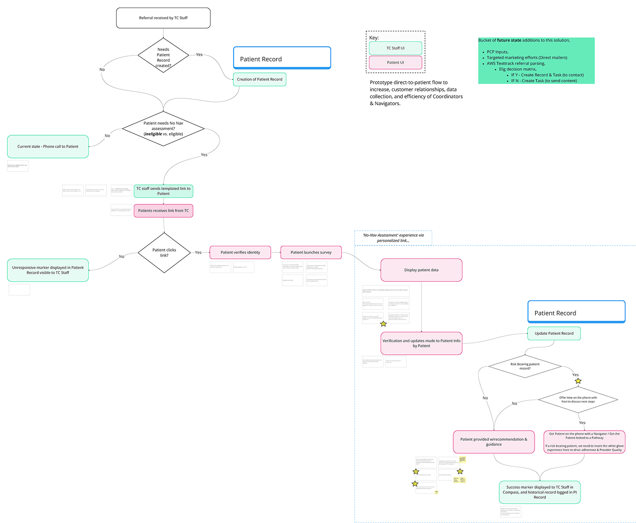
We created a user flow from the initial interaction with TailorCare through all touchpoints, backend triggers, etc.
Research & Personas
I used usertesting.com to allow us to reach the age range of patients who would be using our product. I conducted research using a Figma prototype to get unfiltered feedback from users on body part selection, difficulty in understanding questions, and like/dislike of the recommendations provided.
One key takeaway was that the questions used by our Navigators during phone calls were too medically complex for patients to understand. Working with the Chief Medical Officer, Head of Marketing, and staff Physical Therapists, we were able to simplify the more difficult questions into something the layperson could understand.
Research Takeaways & Themes
Users appreciated the overall ease of use of the intake process, noting its flow, simplicity, and speed. However, they struggled to understand the intent behind specific medical questions, leading to confusion during completion.
- User #5 had difficulty understanding some questions on the first read and had to reread them - "Can you bend or straighten your knee without pain of any kind, unrelated to pain or movement?"
- User #2 noted that it may be good to provide a middle option when asking if the knee is red or hot to the touch. His knee was warm but not red, so he selected no.
- User #12 found some of the questions too vague, so was not sure how to answer them.
- User #24 was confused by multiple questions and what the intent of the questions was.
Intake Question Clarity
Without a certified Physical Therapist on the phone with a patient, we quickly realized we needed our questions to be more explicit and literal for clarity and ease of understanding.
MEDICAL TO LAYPERSON
- Have you experienced a trauma? In the past 6 months, have you experienced a trauma or injury, such as a fall or a car accident?
- Are you able to bend and straighten your knee? Can you bend or straighten your knee without pain of any kind, unrelated to pain or movement?
- Was there a recent injury? Have you experienced a trauma or injury, such as a fall or a car accident, in the past 6 weeks?
We knew this from the initial ideation phase and made the questions easier to understand, but the testers still found them too confusing. I worked with the Clinical Operations Manager to filter all this feedback to them and set that team on making a version of the intake that was more patient-friendly.
I also made more extensive changes to the intake by including images, icons, and explainers for questions to let the patient understand why we were asking particular questions.
Our Initial Approach & Iterations
Initially, we assumed that older users would access our intake via desktop and receive it via email. Due to contractual obligations, we pivoted to a phone number and text-based delivery system.

I created the first desktop design with our initial assumptions.
The pivot to a mobile-first optimized intake assessment.
UI/UX Considerations
Healthcare is complex, but we aimed to remove as many annoyances as possible. Some of Those Annoyances included:
- Everything around finding providers
- Finding ones near you and their contact information
- That speak your language preference
- What type of doctor do you prefer
- That can treat your condition
- The ability to understand the questions that are being asked of you
- In non-medical jargon with helper images where necessary
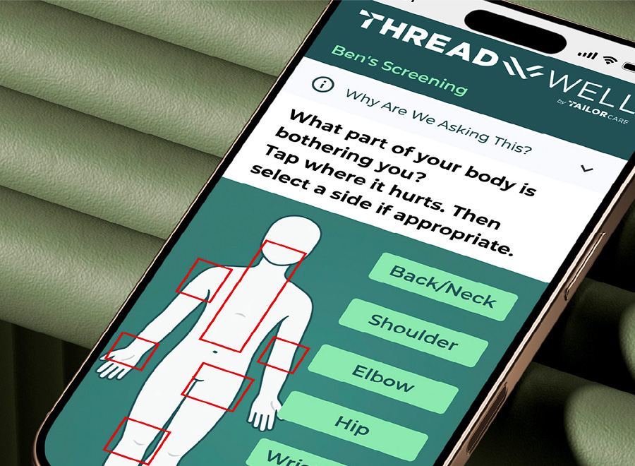
- Quickly selecting what body part you were having problems with
- Without answering long unrelated questionnaires
What Was Done
As we continued to work onn the product, we lovingly started using Minimum Lovable Product instead of Minimum Viable Product within the team, as we would only have one chance to make a great first impression with these patients. Our list of must - haves includes:
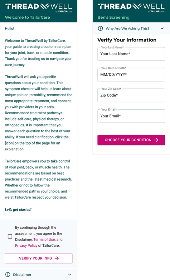
- Verification systems to work within HIPAA
- Patient access to assessment must be secure, compliant, and unique to individual patients
- Provide Patient with a care pathway and provider(s) recommendation
- Arm patients with required info to schedule an appointment with a downstream partner
- When a Patient fails to complete the Self Serve Intake Assessment, allow a reminder prompt to complete the assessment
- Working towards an MLP that we could test and get approval of from various partners
Minimum Loveable Product
When rushing to market, it's easy to fall into the MVP trap. A minimum viable product isn't always one that users will love. Although quickly launching a product is tempting, balancing speed with user expectations is crucial.You only get one chance to make a positive first impression.If the product lacks features users see as essential or fails to meet their needs, you risk exhausting their goodwill or losing them altogether.
The Results
By deeply understanding the challenges and preferences of our user base, we pivoted our approach to create a mobile-first design that prioritized ease of use and accessibility. Contractual constraints revealed that email was unreliablely used by our patients, leading us to shift to a text-based delivery system. We simplified and incorporated non-medical language with helpful visuals and ensured users could quickly find relevant providers based on location, language, specialty, and condition. These insights shaped a design that balanced user needs with regulatory compliance, fostering trust and clarity.
The final designs embodied our Minimum Lovable Product philosophy, balancing HIPAA compliance with a delightful user experience. We created a secure system for patients to complete their intake assessments, access provider recommendations, and call to schedule appointments seamlessly. When users encountered difficulties, subtle explainers encouraged them to understand the why of a question and to continue their journey. By abstracting away as many complexities of healthcare as possible, we delivered an intuitive, approachable system that resonated with patients and partners alike, ensuring a strong first impression and a foundation for impactful care.
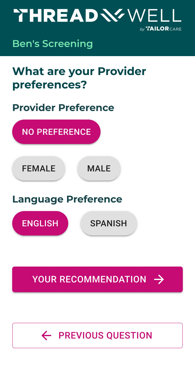
Through user and internal research from our care team, we also learned that allowing patients to choose their provider preferences is essential to them.
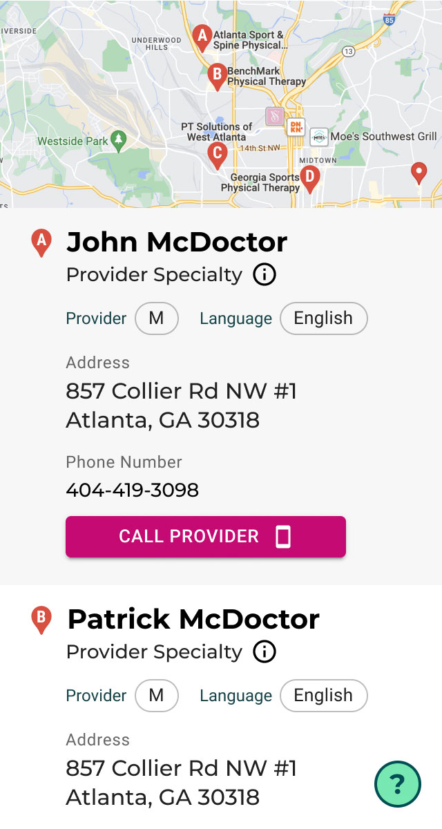
Provide patients with providers near them and the ability to quickly call them for scheduling.
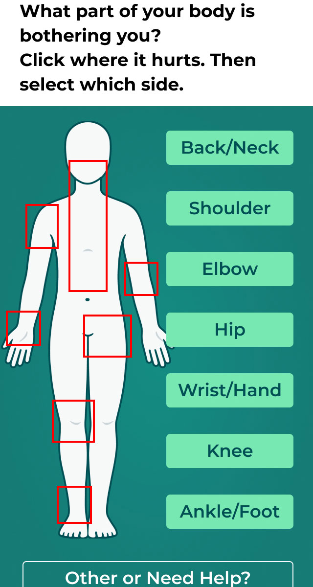
Allowing patients to select a body part right from the beginning quickly was helpful because it allowed us to tailor questions immediately to that specific body part.
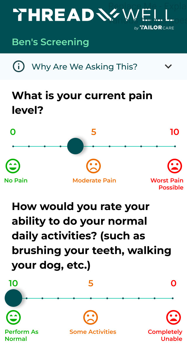
It is vital for us to show patient progress by allowing them to select pain and function quickly, so finding a way for the patients to do this quickly and easily has been a challenge. We are continuing to test different methods for this.
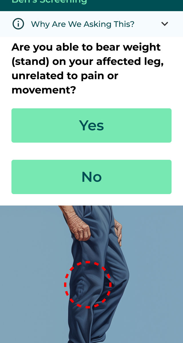
Using images and more straightforward language for more complicated questions has also been a big push.
Achieved Goals & KPIs
- We decreased Navigator time spent with ineligible patients by 60% and continue to refine the process.
- We increased Navigator time spent with high-value patients by 15% and are still gathering feedback on ways to increase this number.
- We maintained an NPS score in the low 80s and have been gathering customer feedback on new features to add
What's Next?
Expanding on more company goals. Saving more Navigator time to make genuine, lasting connections with patients.
The team decided to deprioritize some goals due to complexity. Incorporating insurance providers, for example, required significant backend work. Multiple languages are another heavy lift but will be helpful as we expand into other markets.I 'll touch on a few more below.
- Enabling patients to enter insurance details to filter providers by coverage was considered but proved too complex for our timeline.
- The product manager and I considered this, but it was a heavy lift to find companies to help with that verification, tie it to providers who then also took that insurance, and do all the backend work involved.
- We wanted to incorporate multiple languages to serve as many populations as possible, but it wasn't within the time frame we had. English served the majority of our population at the time.
- Allow Navs to place the patient on the self-serve path if the patient desires.Expand the use of the self - serve intake into other areas of the Navigator process, including touchpoints with the patients. If desired, allow patients to speak with a Navigator while on the self - care path.
- Finally, we can launch our assessment from various digital locations, such as our website, digital ads, etc. A holistic marketing approach to be part of a much larger marketing push in the future.