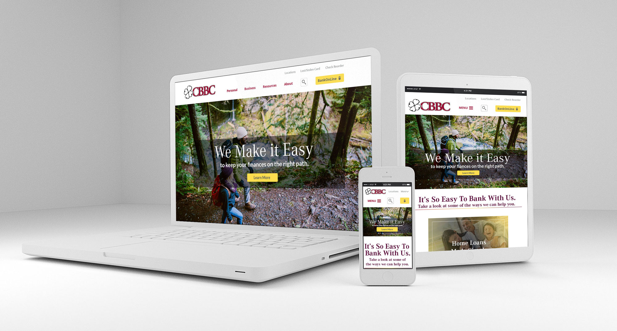
Working at Jack Henry & Associates allowed me to work with a large array of clients all over the country. The main objective at JHA was to bring our clients’ banking websites into the 21st century using the latest design trends and best practices.
I communicated with our banks through conference calls, screen sharing, and other tools to ensure they get exactly what they wanted, making sure the site is current in design and style while still working best for their customers. I worked with the banks to ensure their UI/UX not only accomplished their goals but also made their site easy to navigate for their customers.
We continually had to maintain the balance between, ease of use and the banks needs and security. Through phone calls, example websites and mockups we worked to complete the project that both parties could be proud of and served their customers for years to come.
Champion Credit Union
I strived for simplicity, ease of navigation and large eye catching imagery in black and white to follow along with their current marketing. I also wanted the homepage to be help drive users to open an account and to make search helpful and easy to find. The icon area allows the ability to help users find things quickly and without searching or scrolling.
> Click for full views of desktop, tablet and mobile (Use menu in upper left)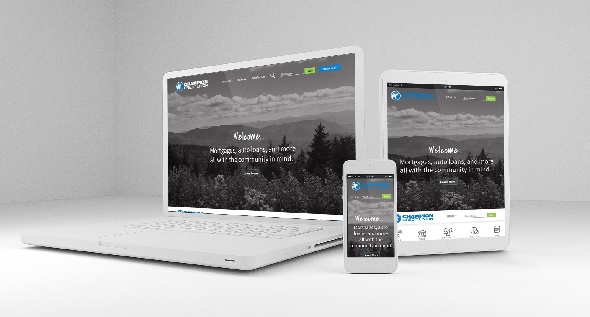
First Arkansas Bank & Trust
FAB&T liked the idea of a tall scrolling website with large areas for each content area. Their social media area was particularly tricky as we wanted to keep it on brand without an intense use of red. We decided on a red hover for the icons which gives it that nice pop without being overpowering.
> Click for full views of desktop, tablet and mobile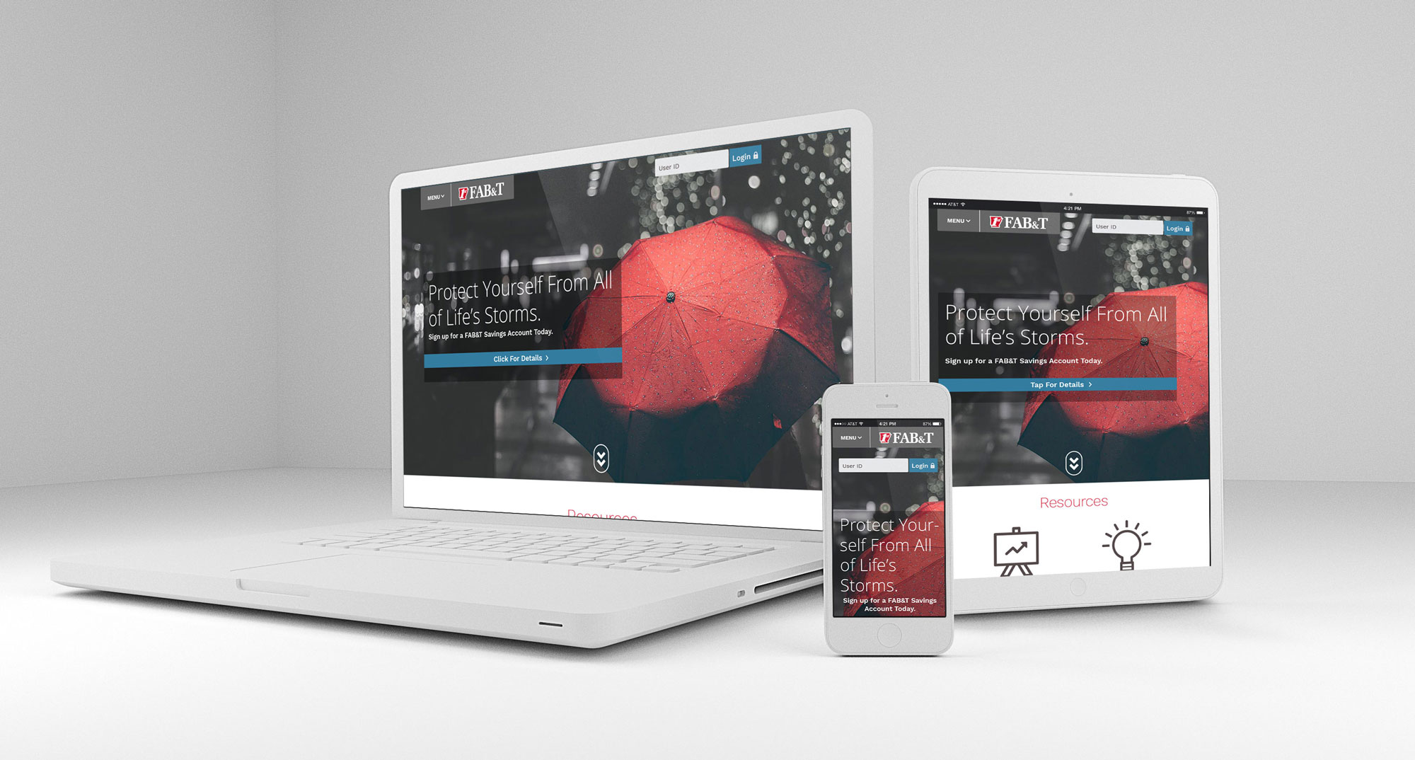
Citizens Bank of New Tazwell
Citizens Bank had an outdated site that was difficult to navigate. They wanted a wide open site with large imagery to better balance customer interest with their ability to advertise new products and garner a greater sense of community.
> Click for full views of desktop, tablet and mobile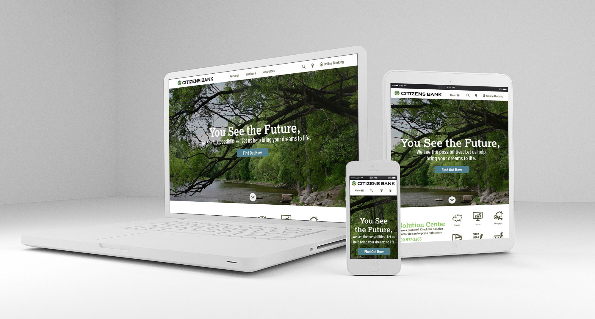
Investors Community Bank
For this homepage I strived to unclutter and separate each of their content areas. The navigation is clean and clear. The search function is easy to find as well as the quick links. I used large images to give the user a clear sense of what they are looking at and what new products and services are being advertised.
> Click for full views of desktop, tablet and mobile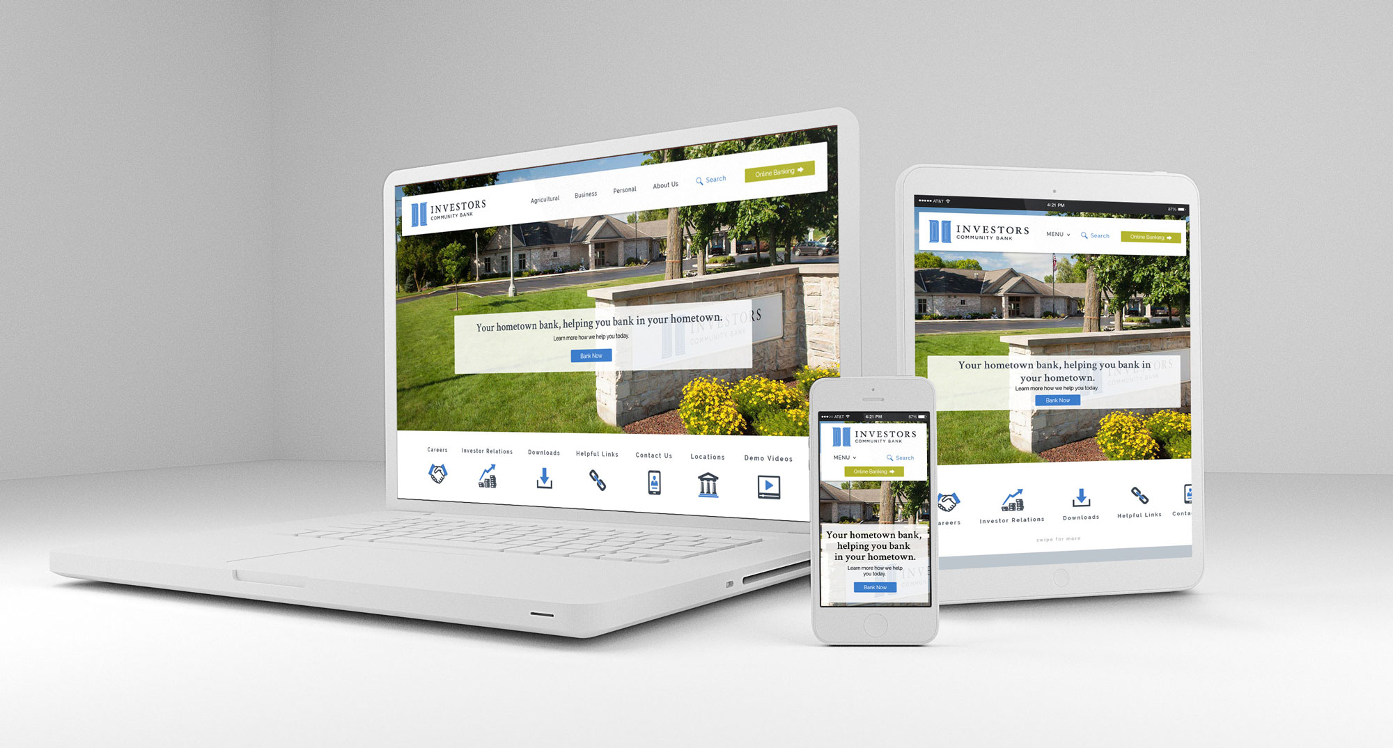
Citizens Bank of Blount County
CBBC wanted lots of movement to keep the site interesting to their customers. While you can't see it on the mock up, we decided on animated hovers (Home Loans Made Simple) and sliding features to maintain engagement without being overwhelming.
> Click for full views of desktop, tablet and mobile